Case Study: Redesign of the FundEx Application
Background
FundEx is a platform that connects capital owners (both retail and institutional investors) with digital, creative, and innovative entrepreneurs in Indonesia. The application aims to facilitate investment processes through crowdfunding services. However, the previous version of the app faced several challenges regarding user experience that impacted user satisfaction.
Objectives
Enhance user experience when using the FundEx application.
Simplify navigation and information access.
Increase user conversion rates for registration and transactions.
Methodology
I employed a Design Sprint approach to redesign the FundEx application. This process consisted of five key steps:
Day 1: Understand and Define
Problem Understanding: Identify the app's goals and the challenges users face.
Define Challenges: Explore main issues such as navigation difficulties and lack of clear information.
Mapping: Create a user journey map to identify critical touchpoints.
Day 2: Sketch Solutions
Brainstorming Solutions: Generate ideas for improvements in the home, login/signup, portfolio, transactions, and profile sections.
Sketch Solutions: Create UI design sketches of the selected features.
Voting: Choose the best designs based on relevance and appeal.
Day 3: Prototype Production
Create Prototypes: Use design tools to develop an interactive prototype.
Focus on Interaction: Add interactive elements that enhance user experience.
Day 4: Test the Prototype
Invite Users: Invite target users to test the prototype.
Usability Testing: Observe user interactions and note any difficulties they encounter.
Gather Feedback: Collect feedback on design and functionality.
Day 5: Revise and Plan
Analyze Feedback: Discuss the feedback from testing and identify areas for improvement.
Revise Design: Adjust designs based on user feedback.
Follow-up Plan: Outline steps for implementing the final design.
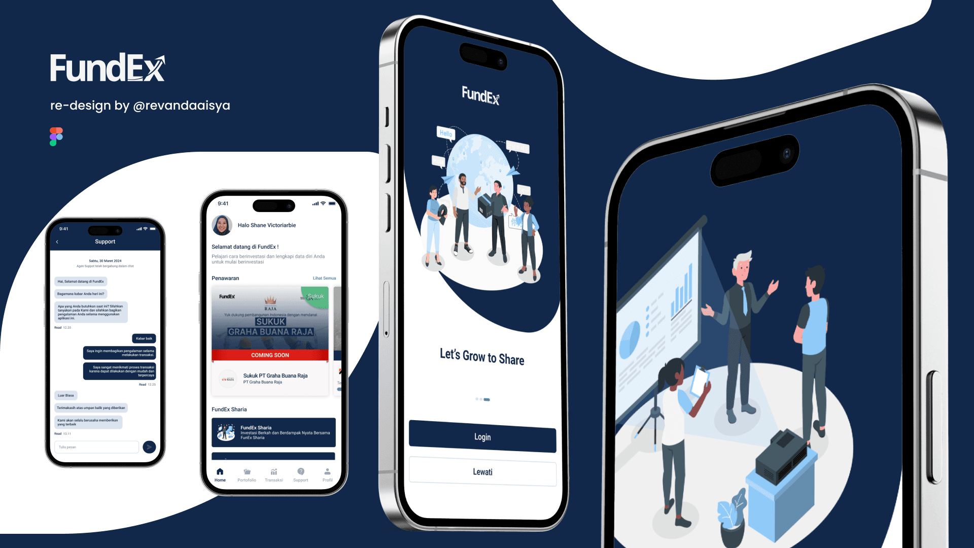
Key Features Redesigned
Home:
An attractive layout with clear information about the services offered.
Integration of recent news and ongoing projects to capture user interest.
Login/Signup:
A simple and intuitive process to enhance user conversion rates.
Use of clear steps and reminders to assist new users.
Portfolio:
A clean and informative view for showcasing funded projects.
Filtering options to help users find relevant projects easily.
Transactions:
A transparent and easy-to-understand process with step-by-step explanations.
Reminders and notifications for every transaction made.
Profile:
A comprehensive profile page allowing users to view their investment history and manage account information.
Easy customization options and customer support contact.
Results
Enhanced User Experience: Feedback from users showed a significant improvement in satisfaction after the redesign.
Increased Conversion Rates: An easier registration process contributed to a rise in the number of new users.
Better Access to Information: Users reported being able to find the information they needed more quickly and efficiently.
Conclusion
The redesign of the FundEx application using a Design Sprint approach successfully met the objectives of enhancing user experience. By focusing on user needs and feedback-based iteration, the FundEx application is now more intuitive, engaging, and functional. This process not only improved user satisfaction but also supported FundEx's business goal of becoming a leading crowdfunding platform in Indonesia.